UX/UI Design
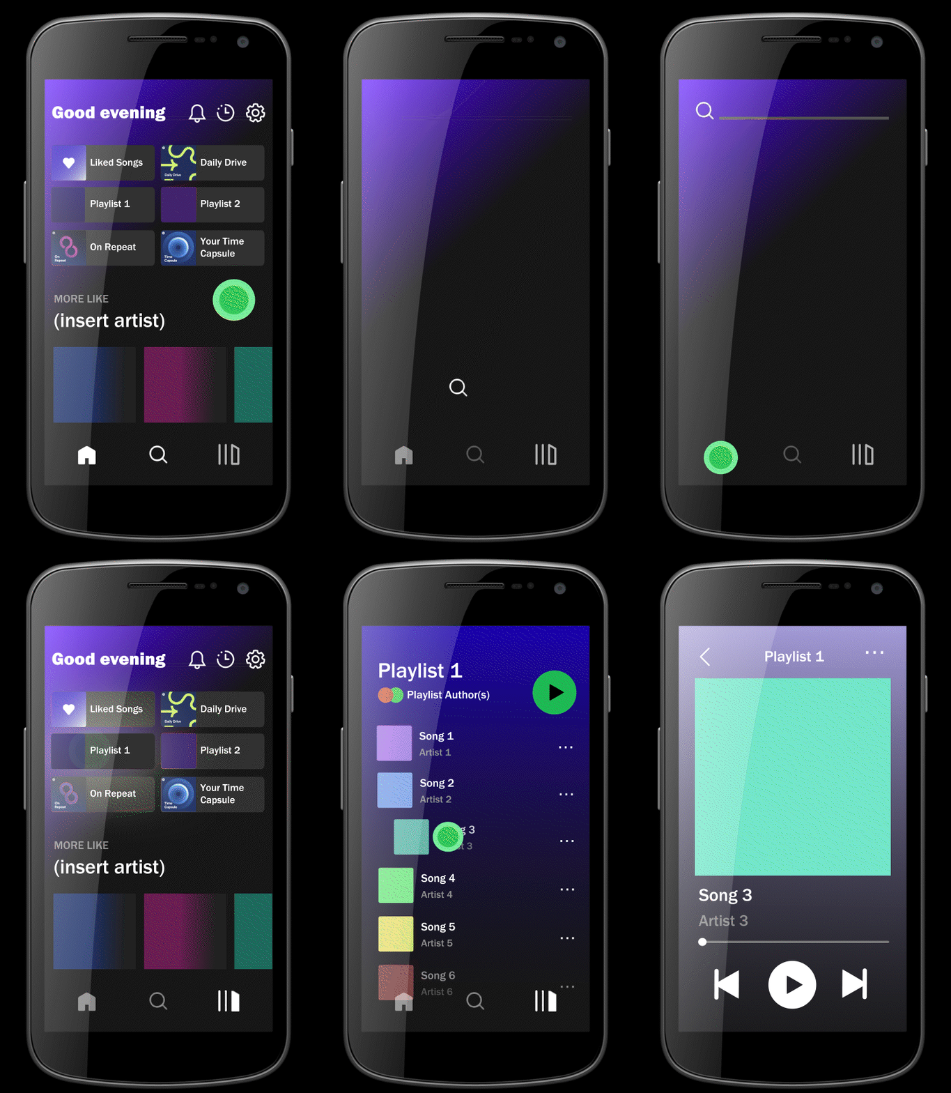
Spotify was in search of new transitions to incorporate into their app. The original transitions were studied before new ones were created for a video rendered prototype.
Spotify Transition Redesign
Overview
Most of the layouts remained the same, but the app was lacking appealing transitions. To breathe new life into the app, various transitions were designed and animated to give viewers an idea of how they function in practice. An active search icon with a text field that spreads across the width of the screen was added. While in the home page, a brightness effect can be seen when a playlist is clicked. From there, the songs move onto into view, which leads into the chosen song growing into the next screen as the play options pop in. Roughly a week was given to brainstorm and build an animation of an improved user experience.

