Dutch Bros Redesign
UX/UI Design
A team of designers were tasked with finding ways to improve the Dutch Bros website. With the use of user testing and heuristic evaluations, issues were identified and possible solutions were discussed. With this information, prototypes were designed to easily integrate the changes into the already established layout.
Dutch Bros is a local chain coffee shop that follows trends and has been serving the community since 1992. Questionnaires, heuristic evaluations, and user testing is used to locate and identify specific issues with the website. From this, each member came up with their own version of a redesign (the images shown will be of the designs I created).
Overview and Purpose
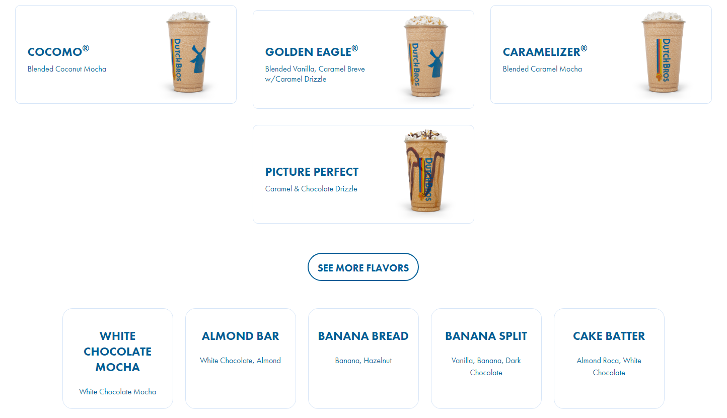
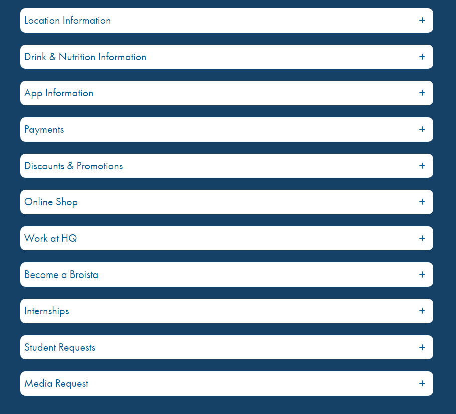
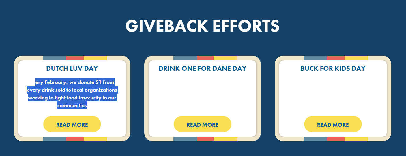
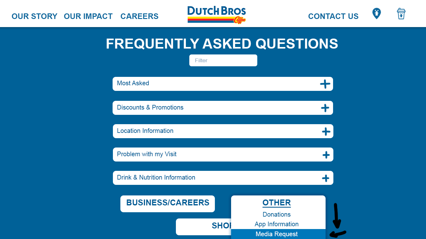
Most of the interviewed users were within the range of Dutch Bros’ target audience. Out of three scenarios, only one could not be completed by any of the participants. After the user testing, issues were found within the menu, contact, and impact pages. Some faced frustration due to the lack of images for many menu items, while others saw the number of options in the contact page as overwhelming and hard to navigate. And interestingly, there was hidden text on the impact page that can only be seen while highlighted.
Results
Redesign
A smaller section of the menu was redesigned. On the page with all chai drink options, images were given to all those that were only text previously. A search box and section with ingredients to select were added to make finding specific drinks easier. And as a small addition, a hover effect was added to the menu items.
The contact page options were organized and grouped to reduce clutter. Drop-downs were added to show more choices related to what was clicked on.
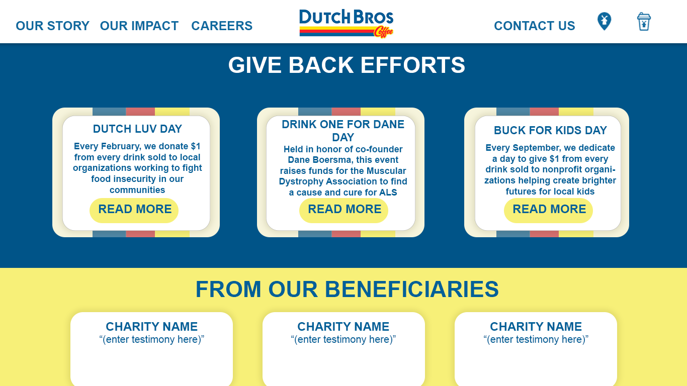
The solution to the impact page was quick and only consisted of making the hidden text visible by changing the font color.
Conclusion
User testing and teamwork were essential to finding issues with the previously mentioned pages within the Dutch Bros website. After, each member interpreted the gathered information in their own way and came to individual conclusions. The redesigns described focused on visuals and simplicity to make the user experience smoother and more appealing.

