UX Design
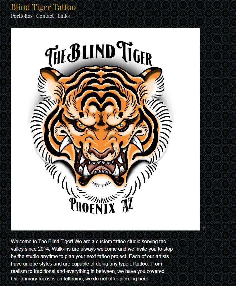
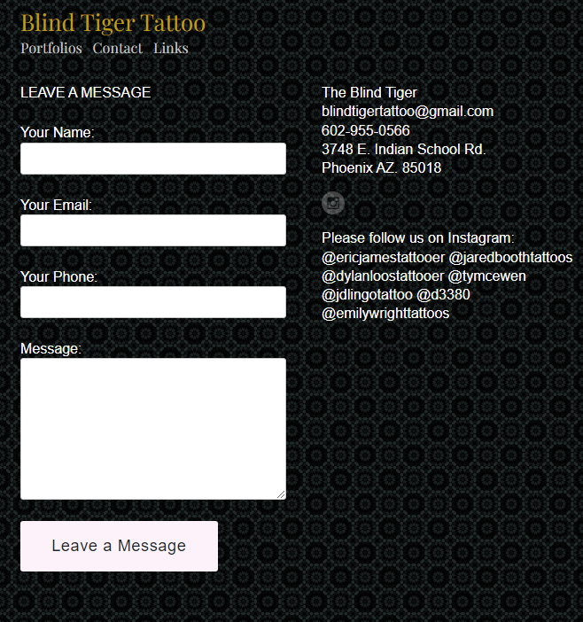
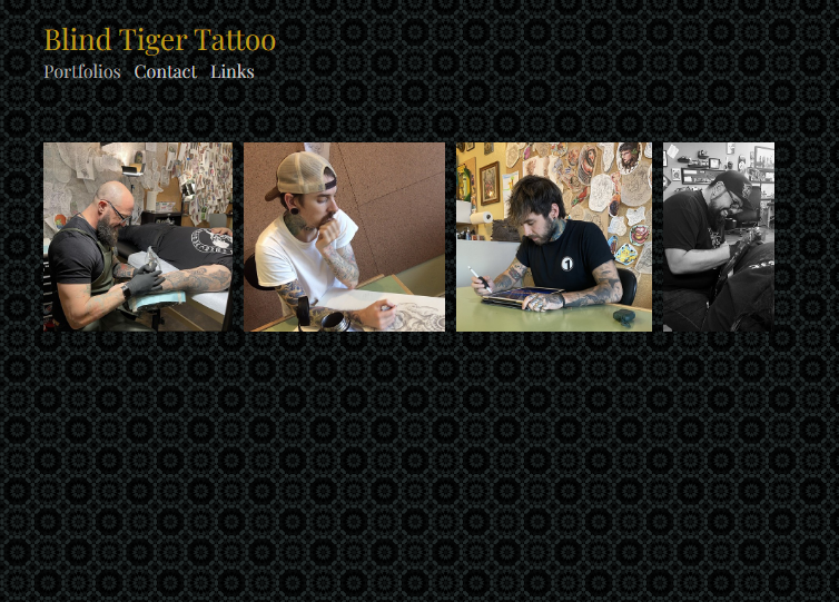
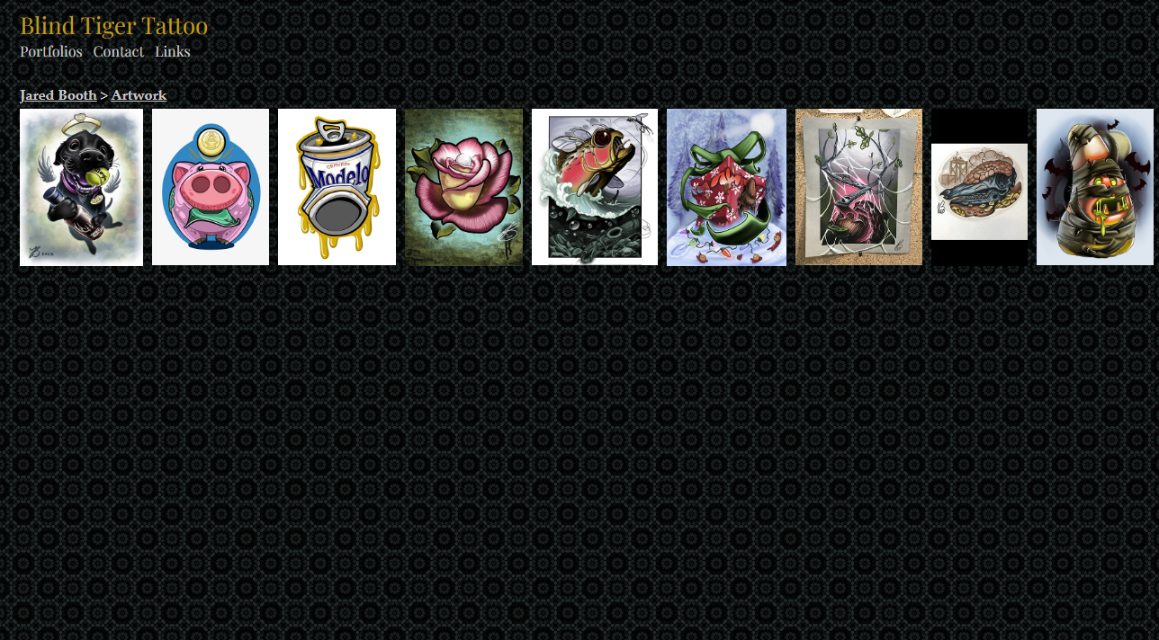
Blind Tiger Tattoo was in need of a website redesign. A case study was conducted and included the following parts: heuristic evaluation and accessibility audit, archetype personas and user stories, and a high fidelity prototype. With the challenge of only using content that was already on the site, new colors and layouts were sketched and later turned into a functional prototype.
Case Study: Blind Tiger Tattoo
Blind Tiger Tattoo is a custom tattoo studio located in the Phoenix area. All of their artists are comfortable with various styles of tattoos along with their own personalized styles. Information about their artists can be found through social media links located on the studio’s website.
Overview
Purpose
Blind Tiger Tattoo has a weak online presence in the form of their website. If a user’s first encounter with the studio was through their website, they are not likely to appear in person. The website is not well designed, the organization of information is confusing, and navigating the site can be frustrating. The website is in desperate need of a redesign to remove these issues and improve the overall user experience.
Target Audience
There are various groups of users that would visit the website. This ranges from users that are researching tattoo studios to those interested in getting a new tattoo.
There was roughly 5 weeks given to complete this project, and about a week to a week and a half was dedicated to each milestone. A unique challenge came in the form of learning Figma during the creation of this project.
Project Scope
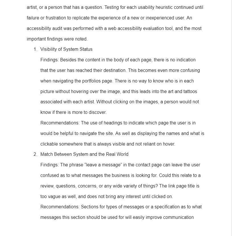
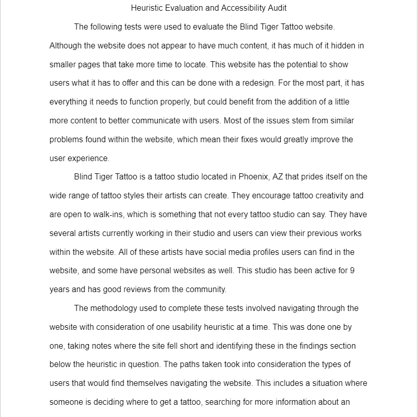
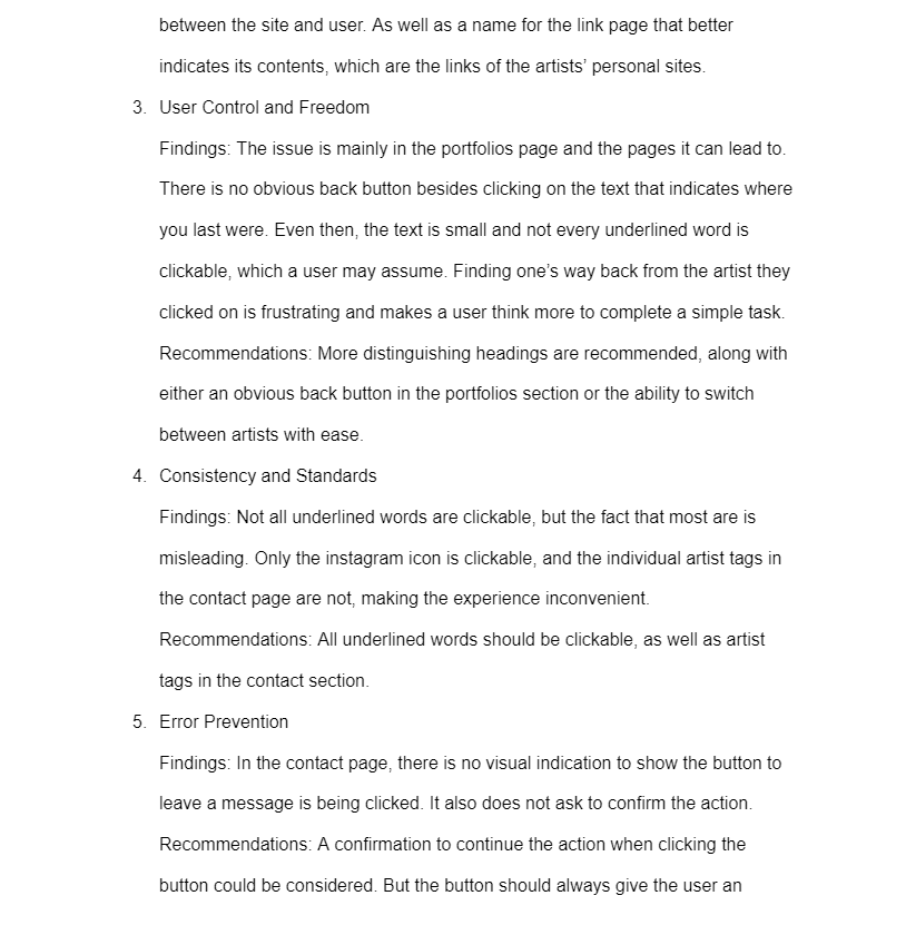
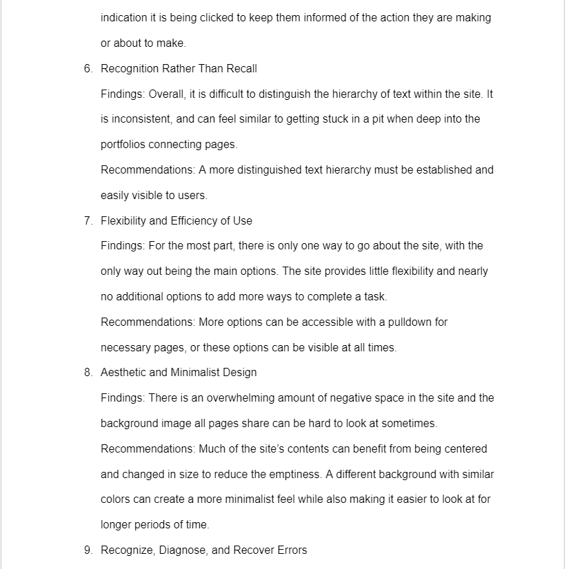
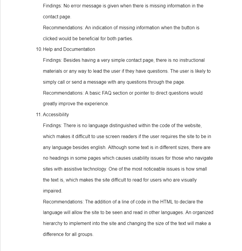
The project was first defined and put through a heuristic evaluation along with an accessibility audit. The creative brief gave a detailed description of the objectives, timelines, and additional information. Meanwhile, the heuristic evaluation and accessibility audit identifies issues found within the website and offers different solutions as shown.
Process and Reasoning
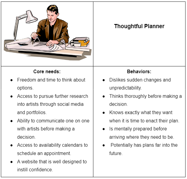
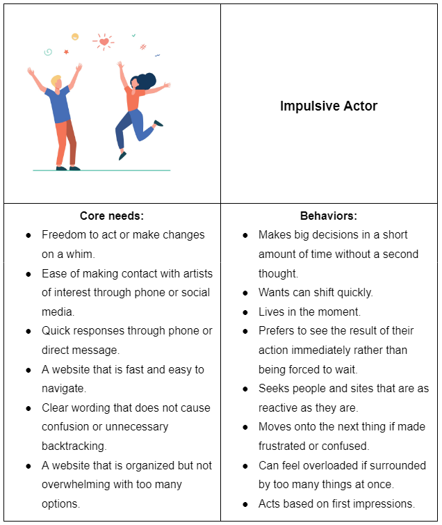
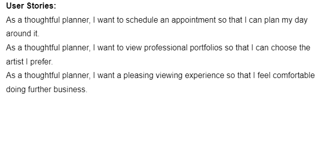
Next, archetype personas and user stories were built based on the target audience. These were separated by personality type rather than experience to create a more accurate representation of those that would visit the website. A few user stories were made to present scenarios that’d bring each archetype persona to the site. This helps better understand expectations and paths they may take.
The first presents a type of user that often has a more thoughtful approach towards tattoos and other things in their lives.
While the other shows a type that is more spontaneous and lives in the moment.
These archetype personas were created by researching the target audience and personal experience.
Archetype Personas and User Stories
This is where Figma was learned by creating a prototype of high fidelity. The link to the interactive prototype is below, and images of the prototype will be used to showcase the changes made. Most changes were made based on the heuristic evaluation and accessibility audit, and some were made while creating the prototype. The high-fidelity prototype gives an idea of how this newly designed website would look and function. The content found within the site remains the same for the most part since the goal was to redesign rather than completely change the information it already contains.
High Fidelity Prototype
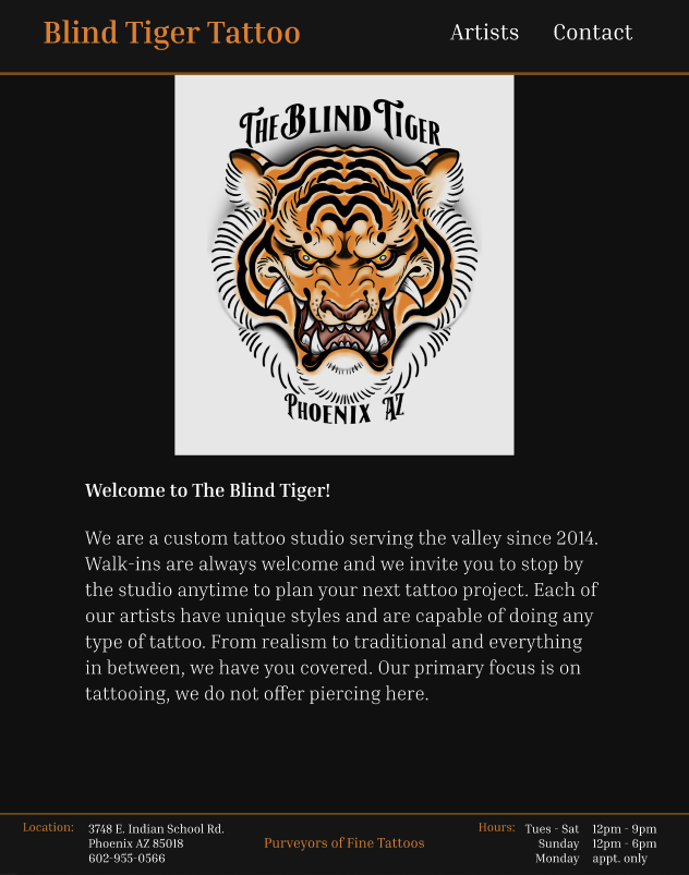
The layout was completely redesigned, from the navigation menu to the footer. A new background was used to draw less attention, and text hierarchies were created to fit this new design. Hover effects were added along with the ability to click functional links throughout the website.
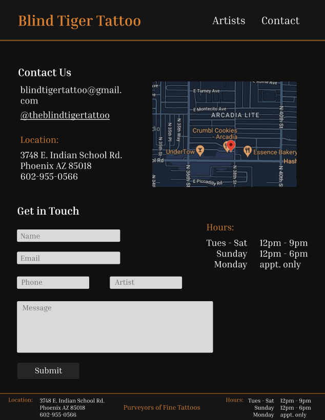
The Contact page was reorganized and given new additional features that reinforce what’s already present. This being the added detail to send a message that is meant for a specific artist, and a more detailed view at the studio’s location on a map. The submit button also gives visual feedback when interacted with.
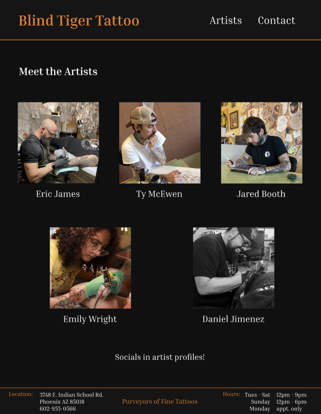
Similarly to the other pages, the Artists page was also completely redesigned to be more uniform and organized. The images of the artists have hover effects that will activate when the mouse is over their picture or name. In the next page, a user path was explored for one of the artists.
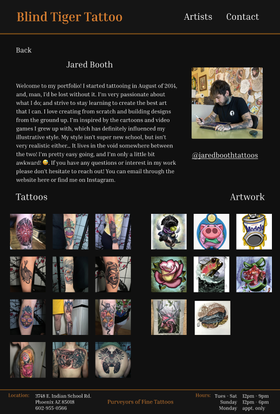
Although this is the only artist page that has been designed, the others would follow the same structure. The artist’s social media link has been moved to his page, where his words to the user and previous works can be viewed. This greatly reduces the amount of pages needed to display the same amount of information and makes use of the amount of open space the original site left.
With the information that was gathered, a high fidelity prototype was created to present the website redesign. Many of the issues that could be solved by a redesign were resolved to improve the user experience. This prototype can be tested with users in the future, as the timeline did not allow for this to be done. One of the main goals was to work with and gain experience with Figma, which required time to produce this prototype. Much was learned throughout the process, and if given more time, the prototype may have become more complex. Being able to work on a small scale website was a great place to start and leaves room for improvement.

